ShopDreamUp AI ArtDreamUp
Deviation Actions


Suggested Deviants


Suggested Collections


You Might Like…


Featured in Groups


Description

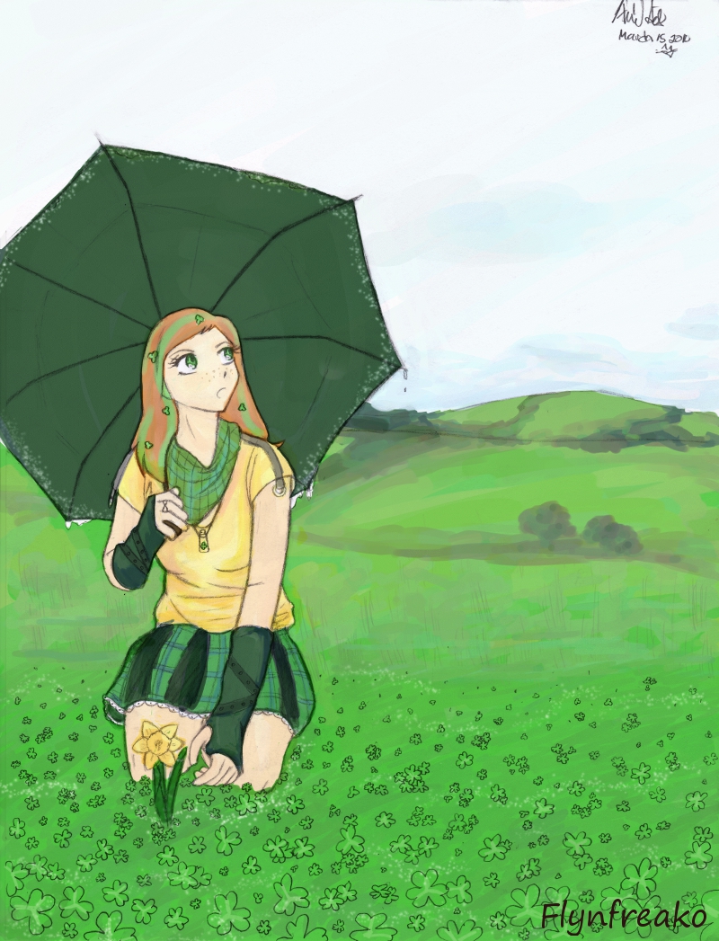
HAPPY ST.PATRICK'S DAY!
Ah, didn't turn out exactly how I imagined, but I'd be lying if I said I didn't like it 8D
The BG was really fun... I haven't done anything in painting style in a loooong time.
2 things bother me, but i checked and re-checked the reference pics so many times; it must be right XD; (umbrella and an arm).
So. I was trying to capture the feeling of spring!
Lots of green, but cloudy because of rain~
Hope you guys like it!
I take commissions!
Image size
800x1047px 572.52 KB
© 2010 - 2024 flynfreako
Comments158
Join the community to add your comment. Already a deviant? Log In
Hello! Thought I'd give critiquing a whirl, and since you mentioned in your journal you'd like some constructing criticism... here goes nothing! <img src="e.deviantart.net/emoticons/s/s…" width="15" height="15" alt="
I really enjoy the concept of the piece, and the way the whole thing sits together compositionally.
My biggest concern is... the length of her neck versus the size of her head. The placement of her hairline makes her head look too disproportionately small, like she has no forehead, and unfortunately also makes her neck look too long. Another note on the neck is the tone line you've placed actually doesn't do anything for the shape of her neck. Sometimes it's better just to leave them out completely, because they don't help the form/figure. That's really a style choice though, so what I say here is pretty much moot in that case.
Her general anatomy is great otherwise, shoulder width vs hips is great, her forearm holding the umbrella is in the right position, and her knees are correctly placed. I love the fact that her torso is angled properly as well.
Smaller sidenotes: I really enjoy how you worked the background to being painterly into foreground detail with the shamrocks, that's a really cool effect. A little tick is the shading should be deeper on her skin, hair, skirt and potentially clothing, although the deep yellow is definitely looking good, so I'm mostly referring to her armwarmers.
The shading will add definition and depth to the figure, and make the whole thing an overall stronger piece. I would love to see definition in the hair more, as well as some perspective on the umbrella.. that's what you identified in your comments. The umbrella is too flat to be a rounded umbrella type thing. It doesn't look like it's covering her, instead like it's bowing out the other way.
Still, the piece is adorable, and I really do enjoy it. You really only have fine tuning to do, because you have a pretty decent grasp on anatomy and such already. ^^